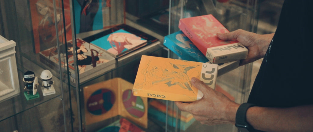
The story behind designing GHOST IN THE SHELL’s logo.
GHOST IN THE SHELL’s logo is incorporated in fashion brand 名 / NA ‘s first season lineup. Can you share the story behind on how you came about into designing this logo?
Teruhisa Tajima : I previously had the opportunity to work with Shirou-san (Masamune Shirow : creator of GHOST IN THE SHELL) on videos and laser disc designs for Black Magic M-66 which is the manga he did before the GHOST IN THE SHELL series. I also had the chance to do some work for Mamoru Oshii (director of the GHOST IN THE SHELL movie) for Mobile Police PATLABOR, so I think my previous work with them lead into asking me again to do work for the logo.
So from that background story on how you came to design the GHOST IN THE SHELL logo, what are your thoughts looking back on the creative process while designing this logo?
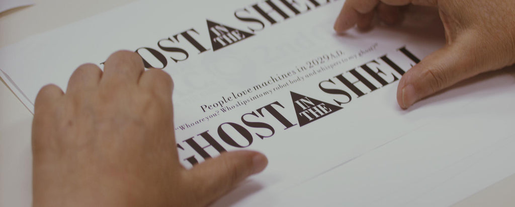
Teruhisa: Well…… looking back on my design, I would say it has a more “literary” feel to it rather than being a “cutting edge” cyber world-esque design. I used Bodoni which is a more classic designed font. I designed this way back in 1995 with my computer so I guess there were not many font packages to choose from at that time. I can't remember exactly why I chose this particular font, but as I said earlier, it really does have a literary feel within this particular font design. I used this English font so the Japanese characters” 攻殻機動隊” and English characters in the logo could balance out in the design. It really is hard to have both English and Japanese characters all in one logo, you really need good skills to do make it work. So I guess when I was creating this design, I really focused on the balance between the English characters “GHOST IN THE SHELL” and the Japanese characters in particular. Also since they only use the English logo “GHOST IN THE SHELL” for international posters, I wanted people to feel some sort of a “Japanese” feel to it by only using English characters so I also had this in mind during my creative process.

I feel the letters “IN THE” trapped in the triangle really adds a symbolic effect to this logo design.
Teruhisa: I think I got this inspiration from when I first read Shirou-san’s original version of the manga and that is where the “trapped inside of a SHELL” part really spoke to me. I have never made any similar designs where I put letters inside a triangle since this one.
©1995 士郎正宗/講談社・バンダイビジュアル・MANGA ENTERTAINMENT
I’ve noticed that the Hollywood version of GHOST IN THE SHELL that was released this year also used this same triangle design.
Teruhisa: A friend of mine also asked me “Tajima-san, did you do the hollywood version too?” which I actually did not. I guess Hollywood felt that this triangle design was very symbolic and used it for their version too. If I were to design this logo once again right now, I still think I would use the triangle the same way and use Sans-Serif* lettering for the logo as I originally did. (Sans -Serif font : Strokes on the end of letters or fonts with no extending features)
You have also been designing logos for the series after 攻殻機動隊(Mobile Armored Riot Police) and I feel that each of these logos have their own distinct characteristics more than sharing similar designs all together.
Teruhisa: Yeah I agree. I guess you could say all of them are different in their own way.

©1995 士郎正宗/講談社・バンダイビジュアル・MANGA ENTERTAINMENT
Of course logos are an element that works along with the artwork, but do you ever think of logos as an individual art piece?
Teruhisa: No, I guess I never thought of it that way. When looking at logo designing for movie titles -logos are always something you see in the opening of the movie right? So by looking at it from that kind of perspective, I would say logos are something that work hand-in-hand with the artwork. I think I never thought of a logo being an individual art piece. I think it's the same with movie artwork and posters. I feel that I am that type of designer that likes to design with always having the artwork in mind. But of course, people who are familiar with my work will immediately notice my distinct style because that is just something that comes out naturally.

©1995 士郎正宗/講談社・バンダイビジュアル・MANGA ENTERTAINMENT
So would you say the different logo designs of the 攻殻機動隊(Mobile Armored Riot Police)series were created based on each story plot?
Teruhisa: For the 攻殻機動隊(Mobile Armored Riot Police)series, we had an idea to make each package design an interesting one. So I would say this definitely had effect to the creative process. Like considering elements prior to the designing stage such as thinking about the printing result etc. The story plots are usually still in the developing process when I start to design, so most of my designs are actually based on a partial story plot where I am not 100% sure on what the story is going to be about. For 攻殻機動隊 STAND ALONE COMPLEX Solid State Society, I remember discussing my ideas with Kenji Kameyama director, but it is very rare to discuss in detail with directors on logo designs during my usual process. For GHOST IN THE SHELL I remember that I didn't discuss in detail for the logo designs and I even think the one you see now was the only design idea I ever even submitted to them.
Do you think the structure in creating anime back in the day was not really developed as it is nowadays?
Teruhisa: I guess that was the case back then. Right now we have an anime production committee where they decide on which logo designs are good or not, so I feel I have to try my best to be thorough in presenting my ideas.
Has anything changed before and after since you first started to work on anime related designs?
Teruhisa: It's not something that has changed in particular, but I feel that anime related work allows me to have freedom with my designs. I know I just said that I have to try to be thorough and all but I think that having creative freedom is why the GHOST IN THE SHELL series have interesting package designs. CD and record designing started to have little creative freedom from around the 90’s and I would say the only work that I had total freedom was probably the artwork I did for Yutaka Ozaki.

A photographer always moving forward with new technology.
Now I would like to talk more about the technical elements in your work. Were you already using computers during your GHOST IN THE SHELL era?
Teruhisa: I was already using computers back then, but it was an era where not so many people were familiar with Photoshop, so the process usually was just me getting the original cel animation from clients and Photoshopping it with my computer. The Blu-ray illustration design for Ghost in the Shell 25th Anniversary was made pretty much with this method as well. I received the original cell animation on paper, then I added color and design to it all by myself.

©1995 士郎正宗/講談社・バンダイビジュアル・MANGA ENTERTAINMENT
I have heard that you have basically been using Photoshop since it was first released. I imagine that using Photoshop back then was something that you needed to master in order to fully utilize the whole software.
Teruhisa: Yeah, the serial number for the Photoshop I own is in the No.20 range which actually Adobe do esnt even own themselves. I guess you can say you needed to master your Photoshop skills back then to be able to utilize the whole software. Back then everything was analog so you first had to own a scanner or else you basically couldn't do anything with Photoshop. You needed to use a scanner to import pictures to your computer. But scanners were crazy expensive and you needed to at least RGB scan each color at least 3 times to get the full picture developed in your computer, which took over 50 minutes or so. Those were sure hard times. The scanners back then were really expensive but I would say had better quality than the one I own right now. Photoshop didn't have any layer features so I had to be extra careful of the pictures I imported into my computer even though everything was supposed to be digital and easy. You were not able to move or edit anything once you Photoshopped an image.

Do you remember your first work that you used Photoshop with?
Teruhisa: (Looking at DINOPIX) I think it may have been somewhere around here. I Photoshopped landscape pictures and Kaiyodo model figures for this one. I think the file size for this was around 10 megas or something. But as I mentioned in your previous question, scanners back then were top quality so I was able to blow up the image to B size really easily.
I feel this piece really brings the dinosaurs to life even though you didn't use any computer graphics.
Teruhisa: Since I am a photographer, I always focus on the lighting in my work. When photography lighting is too dark and you can not really see details, if you include the details in illustrations and tone down everything dark like a photograph, you can easily bring your work into real life. For this particular piece, I wanted to illustrate the atmosphere and show simply how the scenery would look like with a dinosaur in my illustration. GUNDAM PHOTOGRAPHY Fly in Black is also originally a picture, I took pictures of each piece and put them all together through Photoshop. It is really hard to photograph small pieces. It takes a lot of skills or it would literally only look like a real small object, because you need to adjust the focus precisely to emphasize your subject.
What kind of software have you been using since you started using computer graphics?
Teruhisa: I used STRATA 3D. I think it already is a free software right now though……
I have an impression of you always challenging yourself by keep using new technology, but where do you get this particular mindset from?
Teruhisa: I think it simply just comes from my idea that if you keep adding on to your skills you can broaden your own world. In my case, photography was that something that broadened my world. I started out thinking that it would be easier if I could take my own photos rather than struggling to describe to a photographer what my vision was. Since I can think and speak in a photographic standpoint I think I was able to develop and evolve my own distinct style because of this experience.
Do you have any kind of vision to work on videography projects?
Teruhisa: I now make some concert videos time to time. I am also going to work with Shogo Hamada for the “Hamadajima V” exhibition at Shibuya Hikarie. I am planning to present about 5-6 videos for this exhibition. I have done this exhibition in Nagoya previously, but this one is going to be double the size from then and I also plan to do some 4D work as well. I think it's going to be an interesting exhibition for people to see.
I will definitely go and check it out. Thank you very much for your time today!
Interview / Text by Misaki Harukawa
Translate / Tlanslate by Brittany Anna I
Teruhisa Tajima
Art director, graphic designer, photographer, THESDAYS president.Born in Fukoka prefecutre in 1949, graduated Tama Art University Graphic design department.
Worked at CBS Sony (now SonyMusic Labels INc.) ‘s design office and worked abroad in USA.
Became freelance since 1980, founded his design production “THESEDAYS” in 1992.
Photography and art director for packaging covers of many musicians such as Shogo Hamada and Yutaka Ozaki etc.
His work has no limits- he does all areas of graphic designs in editorials, posters, advertisements, calendars, photo books and bindings for novels, comics etc.
Many of his works are anime related and has been involved since the start of 攻殻機動隊(Mobile Armored Riot Police)and 機動警察パトレイバー (Mobile Police PATLABOR) etc.
Since the beginning of Mac computers, he has focused on digital designs, digital photography using technology and published the world's first computer graphic dinosaur photo book “DINOPIX” in Japan and America in 1994.
As an author he has published computer graphic photobooks, analog photobooks, design books, novels etc.
He recently has actively been working on videography using PremierPro.
■Hamadajima V
Shibuya Hikarie Hall9F
2017/12/21▷2018/1/8
EXHIBITION PLACE
▼Venue:Tokyo・Shibuya Hikarie 9F
Hikarie Hall HallA
※Please refrain from contacting the venue for any inquires regarding this exhibition.
OPENING DAYS
▼Exhibition hours:2017/12/21(Thursday)~2018/1/8(Monday・National holidays)
※2018/1/1(Monday・National holiday) - building is closed
OPENING HOURS
▼Exhibition hours:OPEN 11:00 am / CLOSE 9:00 pm
Final entrance is 60 minutes prior to close time. ※2017/12/31(Sunday)、2018/1/2(Tuesday)、1/8(Monday・National holidays)- Closes at 6 pm
▼URL: http://shogo.r-s.co.jp/hamadajima/index.html